08.06.2016 ― With trial and error
Looking back
Background
How to turn data into something meaningful? To create something that is more informative than looking the original dataset. It might take work and effort for gathering good data, scratching its surface and cleaning its flaws while eagerly waiting to get started with the real mining. It might include finding multiple special cases in data or levels, textual exceptions and other random analysis-party-poopers that while encountered, forces to get back into cleaning the dataset one more time. In total, it might be long journey to finally reach an outcome. Especially a graphical one – a visualization.
Rather than trying to make the data look pretty, one should aim for turning the data into results. Since the data do is beautiful on the moment the visualization tells more than 1000 words, it combines all the important information in from the data and opens new ways to see the original concept. Efficiency is beautiful. Some say that visualization could be considered to be used as such analysis method, where one is not certain what results to look for. Many ready targets could be turned to some sort of numbers or test values, but in case one is not sure what to expect from the data, using visualization could be a valid searching tool. Consider basic example of a data that being turned to descriptive values might give very detailed idea of the distribution. But by looking a shaped scatter plot it could tell in an instance, if there is clear simple dimensional pattern or formation to be found.
Could images be even easier to interpret than pure text? If given a text describing a dataset, it takes time to process and understand its full content, but by looking an image it gives all content on a first blink. Then again, if the graphical solution format is not common for the viewer, the blink might turn out to be quite long one. Accompanied with raised eyebrows.
Sketches
If using visualization as an exploratory way to create accidental discoveries from the data, some sort of tactical strategy should be conducted. To be honest, having unknown target to reach with new data, most fascinating way to learn something is pure trial and error -method. Its highly complicated execution order follows:
STEP 1. Try something
STEP 2. Did it work?
↳ no ⇾ return to STEP 1
↳ yes ⇾ EXIT_SUCCESS
As there are no limitations by format or settings, it is up to creator to craft something. Then one checks if it works. If not, does it again until it works. One should stop either when reaching a working output or memory runs out of space, that is person involved can't remember whether the next idea on the row has already been applied or not. Sometimes after hundreds of iterations (repeated STEP 1) one's mutated piece of random results still refuses to look anything meaningful – which happens to be also a result. Many researches of course try to end up in a way that any sort of important dependency or conclusion would be reached, but sometimes the outcome do is that nothing is found. Thus EXIT_SUCCESS is optimum, EXIT_FAILURE is reality. Yet, as with many cases, the journey is rather more exciting than the end point.
In the case of movie dialogue, the journey took 180 degree route change after seventh trial.
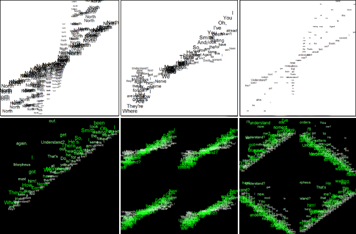
First trial was a simulated plot of word 'North' arranged in different levels and locations on a 2D plot. Having decided to craft something with dialogue data (the Matrix) then came an idea to use dialogue text instead of a static word. Next plots came in same black and white concept and overall execution, being rather simple layouts of dialogue. After adding more colors into the plots, the visualization started to look slightly better. But there was still not much new information derived from the data. Outputs seemed to give nothing new information and the visualizations were too messy to be any useful. [1]
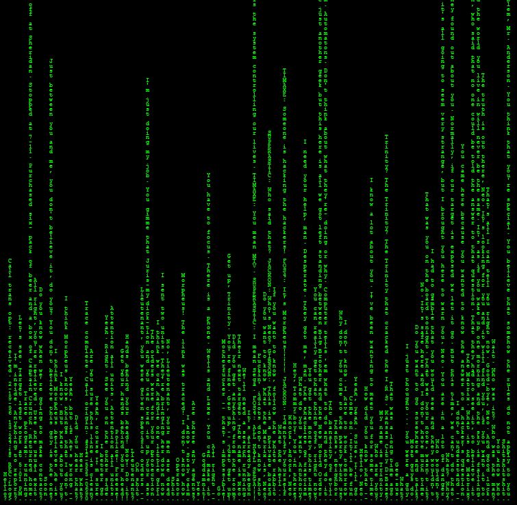
Given the fact that dialogue is made from words, sentences and scenes, starting linguistic approach was quite obvious choice. To gain some new information from individual dialogue lines, which in this case was putting each line as a single bar in barplot, created finally new ways to see the lines [2]. In the movie there was the concept of digital rain [3]. To mimic the original visual effect, each bar was placed letter-by-letter from top to down. Now one could at least notice the length of each dialogue line, being able to make assumptions and the conversation depth. While having this letter positioning, all the ending characters were laid into the bottom of the plot – forming a straight line. It seemed very unanimous:

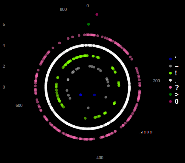
This lead to another kind of data – time series of sentence endings. The whole execution was presented in earlier post of 07-03-2016 [4]. This final output (below) wouldn't have been reached without its earlier iteration rounds. In an ironic way, most of the original dataset was actually abandoned and only a minor part (1 character/sentence) was used in the end. It was as taking advantage from less obvious dataset of the dialogue.
End result
Trials create errors, errors create learning.
∎