01.29.2017 ― Gutenberg approach within R
Trying to understand a book without reading it, take II
Background
'Curiosity killed the cat' they say. With text positioning the killer seems to be rather modern era of screens.
Humans observe data visually with their eyes and while they do so, there are numerous of processes running in the background to ensure that information is captured and processed. To understand what one is seeing is another thing than purely processing it, thus making data even a bit human-friendly is highly recommended.
Excellent example library of these processes (running underneath the surface) are the famous Gestalt laws [1]. Even listed features of cognitive science [2] might have cultural dependencies also, these rules do make sense how people understand visual data in general. With text context I recognize at least few of these.
-
Law of Proximity is included when dealing with groups of textual elements. One assumes that set of nearby sentences create a paragraph. In each paragraph there is also a point that clues the ideas together. Even paragraphs are likewise close to each other, they are separated by line break and maybe line spacing. Thus it is easy to understand that paragraph content belongs to same group of information.
-
Law of Similarity is observed when comparing multiple paragraphs. As they have same format and appearance, one might easily assume that they are equal in comparison. These chronologically ordered paragraphs create a chapter under its title.
Said this, it has been a joy to read books, brochures and posters that take advantage of inserting their own individuality into monotonic text positioning. When a poem, a song or a road sign takes a place in a book, and is separated from rest text by alignment, font style or positioning, it gives the element a special role. By law of Symmetry viewer will concentrate into whole rather than details when the execution is crafted into symmetry. Vice versa, the element that is highlighted from the mass is easier to be captured and notified. It could be even easier to remember by being exceptional.
Yet, using these small but effective ways to highlight text elements seems bit troublesome in these days. As Gutenberg's invention – movable type – created a revolution in area of sharing textual information, same did the era of internet and mobile appliances. One thing that differs with print and others is the context of the text: if it's printed, it's static; if it's not, then it's vulnerable for scaling based on the screen. While many applications already handle differently shift+enter functionality (that is to enable a single line break), it could be certain that text positioning has been totally less considered within current media platforms. Things are usually understood as a mass of text, that is stretched within the device and screen properties when needed. A writer has less power to decide how a text layout might look in detailed level, as f. ex. there will be already differences between browsers and screen devices. If not using forced line breaking, a text might still be seen quite differently on a mobile device and a computer screen. Only handwritten, printed and pressed text stays as original form, while all electronic ones can be altered for modifications.
Nevertheless, it seems to be more challenging to be sure how the text will be assembled (and not even mentioning the problems with font settings...). Even tweets could be done visually more outstanding from the mass if using line breaking in effective way.
Execution
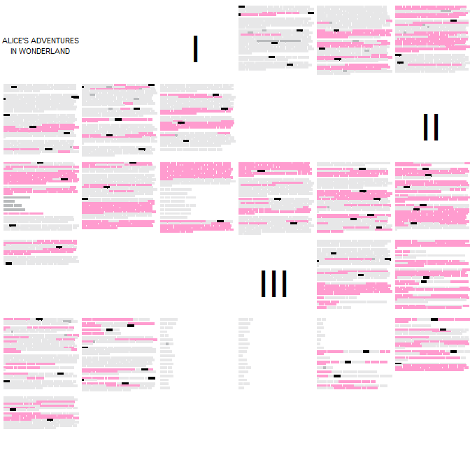
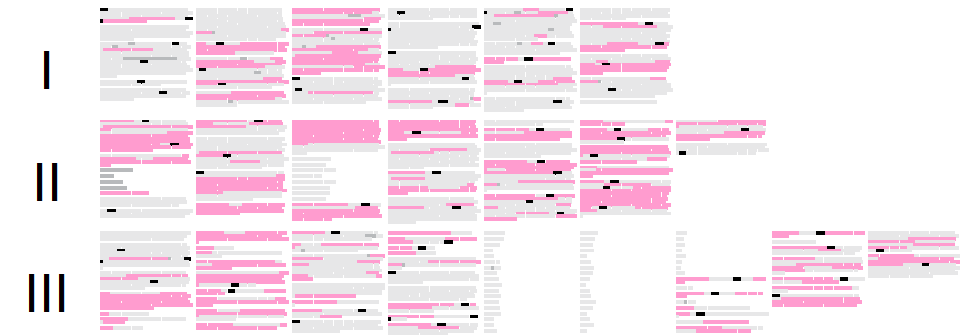
How much do one miss without static text positioning features? When it comes to data analysis, it does effect a bit. Things are easy to convert into numbers as soon as one knows what they are supposed to count. But times, purely visual observing can do wonders. Therefore I created visual page layouts from three first chapters of Alice in the Wonderland. As text printer I used R.
The content was processed as one text mass and divided into imaginary pages, though not identical page sizes or positioning to the original book pages. The text was inserted as color blocks, sized determined by character lengths (in mono), in attempt to delete content brought by linguistic information and purely use only text length, paragraphs and positioning as variables. Yet, to see how the chapters proceed and what they contain in upper level by linguistic side, I inserted four colors: grey as descriptive text; dark grey as capital text; pink as quote text and black as a word 'Alice'.
Of course the story starts with rather descriptive text part to get the reader placed on a map. But after that things get interesting. There are many ways trying to comprehend the plot. Here there are something cryptic but also some content that does make sense by looking at it. After execution the content was observed again. What the current execution did miss was the beautifully way to position wavy text between Alice and a mouse in chapter III. Text alignment and positioning cannot definitely always be removed without losing something relevant.
Result
Would be nice if future would not delete all visual features from text,
as static text its own charm. And art.
Curiosity might have killed the cat, but satisfaction brought it back.
∎